


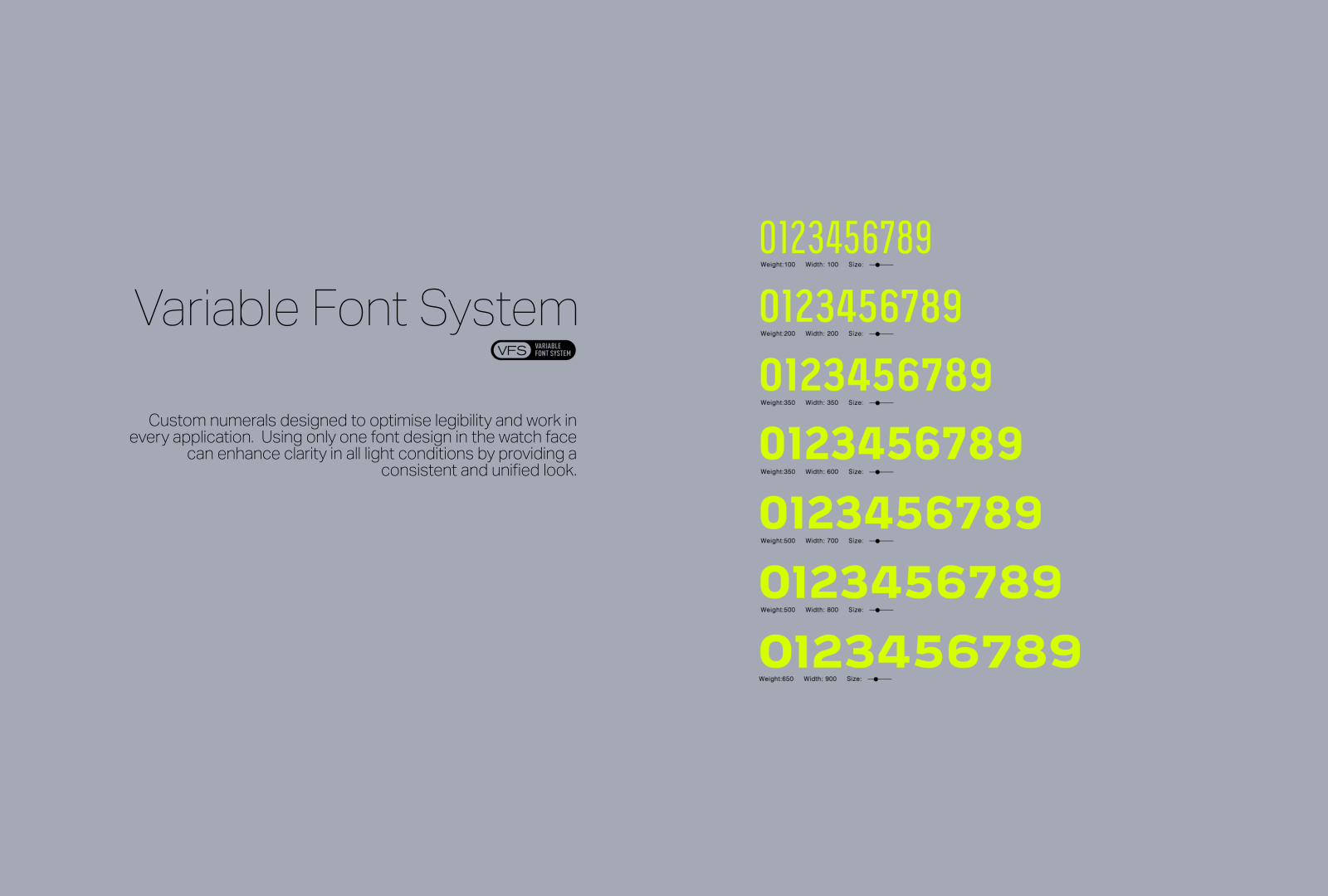
Redefining numbers
In recent years, many modern analogue watches have placed less emphasis on typography in their design. This is because the primary function of an analogue watch is to tell time, and the focus is often on creating an attractive and legible display of the time, rather than creating a unique typographic identity that can be combined with all the above.
Typography plays a crucial role in watch design because it is the primary means of displaying information on the watch face. The typeface, font size, and layout must be legible and easy to read at a glance, while also fitting within the limited space available on the watch face. Additionally, the typography can also be used to convey the design aesthetic and brand identity of the watch. A well-designed typography can make the watch look more elegant and sophisticated and also make it easier to read the time and other information.
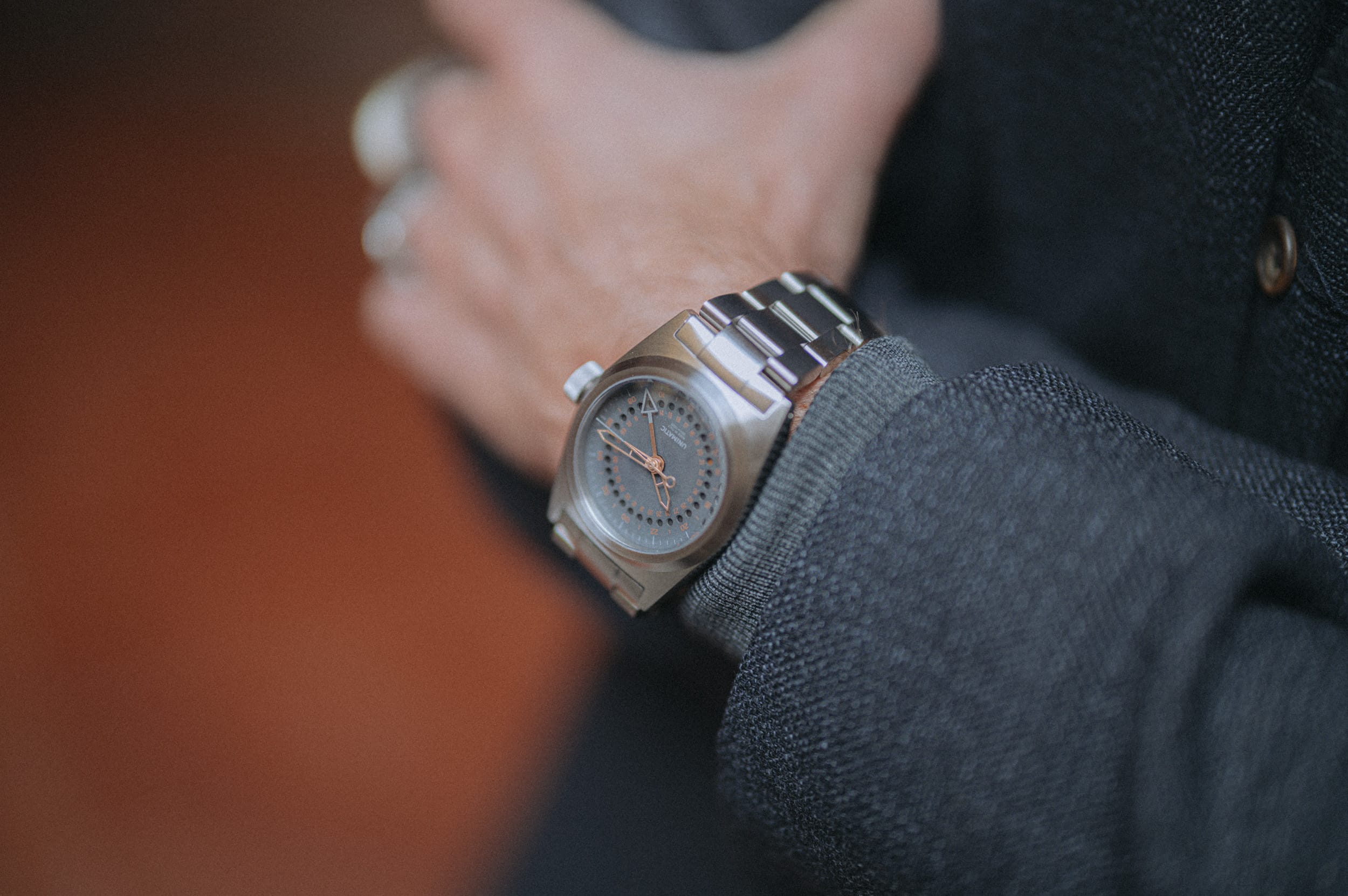
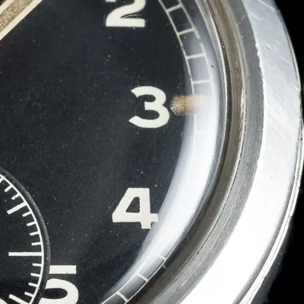
Watch design might be considered to be very particular. The typography of watches even more so. While the typography supports the general aesthetic of a watch it also serves a very specific need: Readability. A watch face offers very limited space within the numbers must perform. Space that is shared with hands, date windows, graphics or chronographs. More often than not numbers are covered by the hands making them even harder to read. Or they need to stand the test of being upside down on rotational bezels. Additionally the surrounding light might be less than perfect, or visibility under water may be really low. Distinctive forms and precise type settings are the bare minimum for perfect watch typography.
The UNIMATIC number typefaces reference this traditional lettering found on such classics of military watch making. Yet they combine this with more recent examples of watch typography as found in the most famous recent watches. These rather modern and geometric number styles reference a Bauhaus and German »DIN-Norm« aesthetic: Perfectly round inner forms with almost no line contrast. By using the most basic geometric forms such as circles and straight angles these kind of typefaces feel very familiar and established therefore emanating clarity and reliability.
Mixing the two styles in the Unimatic numerals typefaces created a blend of human and technical feel. Something that is very inherent to UNIMATIC watches: Technical precision for very human experiences.
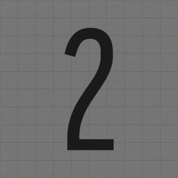
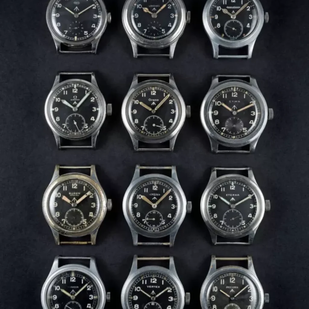
Keeping the balance between the limited space and optimal readability is a constant area of conflict to the watch designer. Historically this led to very specific letter forms in watch numbers very obvious in the number four. The dirty dozen watches are a perfect example of this lettering tradition. While none of the manufacturers followed a strict typeface/lettering template and each watch has slightly different number forms, the general style is transparent and consistent.
Henning is the founder of Character Type in 2018. He is a professional type and communication designer, typographic consultant, creative director and lecturer. After having studied in Potsdam and Melbourne he published his first typeface family Haptic for which he won the prestigious TDC2 award. He has been responsible to design typefaces for brands such as Schwäbisch Hall, Süddeutsche Zeitung, the e-commerce giant OTTO or the publishing house MedienUnion. Henning Skibbe is a member of the Art Directors Club (ADC) Germany.
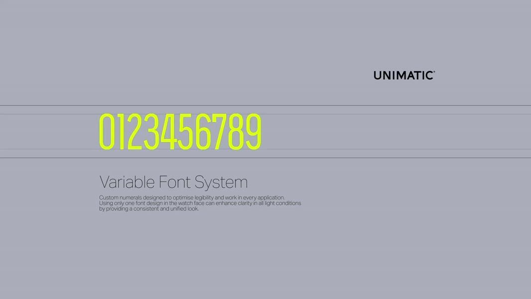
Using only one font design in the watch face can enhance clarity in all light conditions by providing a consistent and unified look. Some pros of using only one font design include:
- Consistency: Using a single font design throughout the watch face can create a cohesive and consistent look, making it easier for the viewer to quickly and easily read the time.
- Legibility: Using a single font design can make it easier to read the time, especially in low light conditions. A consistent font design can also make it easier for the viewer to quickly recognize the time, even at a glance.
- Brand Identity: Using a single font design can also help to create a unique brand identity for the watch. A consistent font design can be associated with the brand, making it easy for the viewer to recognize the watch as a specific brand.
- Simplicity: Using a single font design can make the watch face look simple and easy to read, which is important for a device that’s main function is telling time.
- Flexibility: Using a single font design can also make it easier to adapt the watch face to different dial sizes and different font applications
By using only one font design in the watch face, a designer can create a watch face that is easy to read, consistent and has a strong brand identity.
FEATURED in the TOOLWATCH LINE

Modello Uno UT1 Toolwatch – Diver
Individually numbered€ 520,00Modello Uno UT1-GMT Toolwatch – GMT
Individually numbered€ 640,00Modello Quattro UT4 Toolwatch – Time Only
Individually numbered€ 430,00Modello Quattro UT4-GMT Toolwatch – GMT
Individually numbered€ 550,00